
Documentation
The analysis graph.
One graph that brings the target, your balance, the EQ and the sections together.
Reading the graph
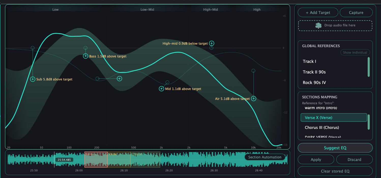
The horizontal axis runs from 20 Hz to 20 kHz on a logarithmic scale; the vertical axis is decibels, shared by everything on the graph. The shaded band is the target zone of your active references, the solid line is your track's tonal balance, and the thin curve is the analytic response of your EQ.
The curve follows your song
When the playhead is inside a marked section, the graph switches to that section's world: the zone shows the section's own reference and the balance line shows that section's average. As the song moves into the next section, the graph follows in real time.
Band nodes
Each of the six bands is a circular node on the graph. Drag it to change frequency and gain, use a two-finger scroll gesture to adjust Q, and click it to open its floating panel.
HPF/LPF nodes
The two diamond nodes sit at the edges of the graph. They start off and turn on automatically as you drag them away from their default position, and their slope is adjustable like any band.
The floating panel
- Frequency, gain and Q
- Shape — Bell, Low/High Shelf, High/Low Pass or Notch
- Slope — from 6 to 48 dB per octave where it applies
- Channel — Stereo, Mid or Side processing for that band
- Power — enable or bypass the band without losing its values
- Dynamic — turn the band into a dynamic EQ and set its range
- Solo — hear only the band's natural frequency range
Suggest EQ preview
When a suggestion is active, ghost nodes appear on the graph showing the proposed moves, each with a short text of how far it is from the target — for example, 3.2 dB below target. Nothing changes until you press Apply or Discard.
The graph is built for one look at everything: if the balance, the target and the EQ all live on the same axes, a decision takes one glance instead of three windows.